Pipeline
Pipeline Component Overview
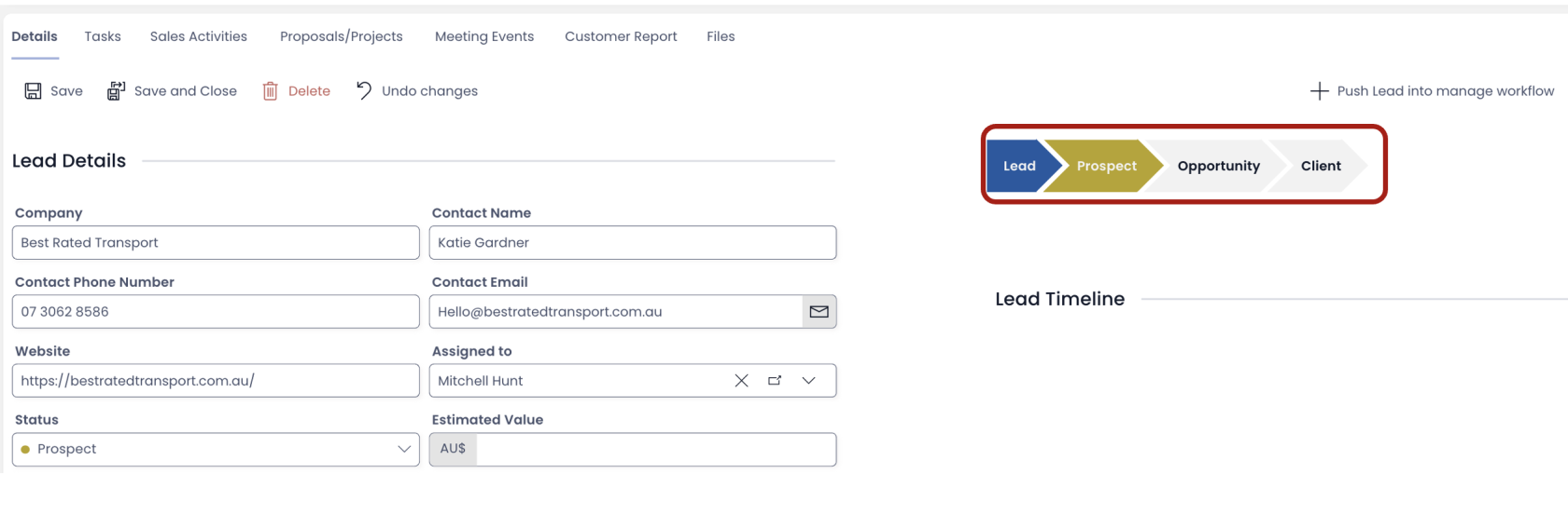
Imagine you are a Sales Manager. You work with the Sales Leads Table.
Now, you want to see the progression of a lead across the Sales Funnel. Let us assume there is a Choice Type field "Sales Stage" with choice option values as:
- Lead
- Prospect
- Opportunity
- Client
These are the four stages of the Sales Funnel that you have defined.
You want to see them visually progressing from one stage to another.
This is possible through the Pipeline component.
We can think of Pipeline Component as a visual representation of sequential choice fields. The work sequential is important as it is meaningful when we have choice values that can be depicted in a sequence / progression. For instance: a choice field - Hobbies with choice options as Sports, Reading, Cooking etc. cannot be meaningfully represented as a Pipeline (from a logical perspective).
How to set up Pipeline component in Designer
-
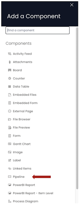
You can add the Pipeline component on to the Layout / Page. The Pipeline component is not present anywhere by default.
-
If the Pipeline component is on a Grid Layout, you can resize and move the component over the layout.
-
You can set the **visibility of Pipeline on the Details breakpoint.

-
You can set the visibility of Pipeline on the Create Screen breakpoint.

-
You can make it mandatory for the user to select a value from the Pipeline component by clicking on the * button. If the icon turns red, it means the field is mandatory (required) field. A white * icon denotes non-mandatory field. You can toggle by clicking on the icon.

-
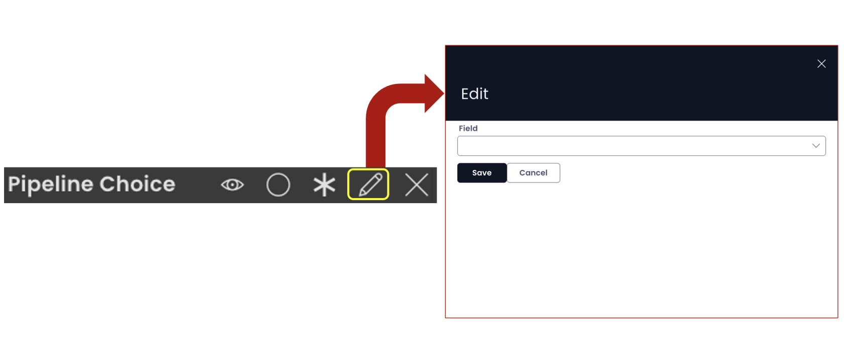
You can configure the Pipeline component by clicking on the Edit (pencil) icon.
-
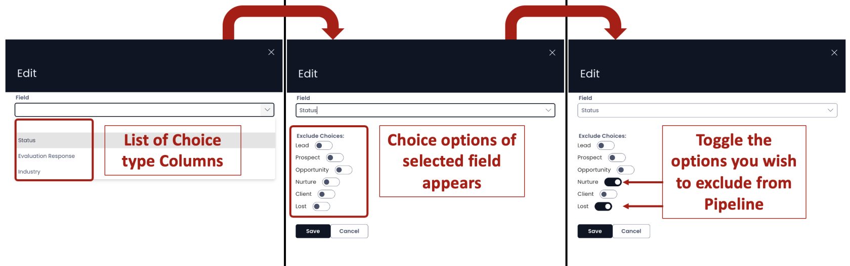
In the Edit panel, you the "Field" dropdown shows a list of all the Choice Type column names. Please note, the Pipeline component will refer to the subject Table only (on whose Design Tab you are adding the Pipeline component).
-
You can select the desired column. It will display a list of all the choice options value.
-
You can toggle off the choice options that you wish to exclude from the Pipeline. These values would not be shown to the user in the Pipeline component in Explorer.
-
As you save the component and Page, you can see the Pipeline on Explorer as defined.
Important points
-
In case, the Pipeline component is created on a Choice type field which has a default value, then mandatory (required) won't be effective.
-
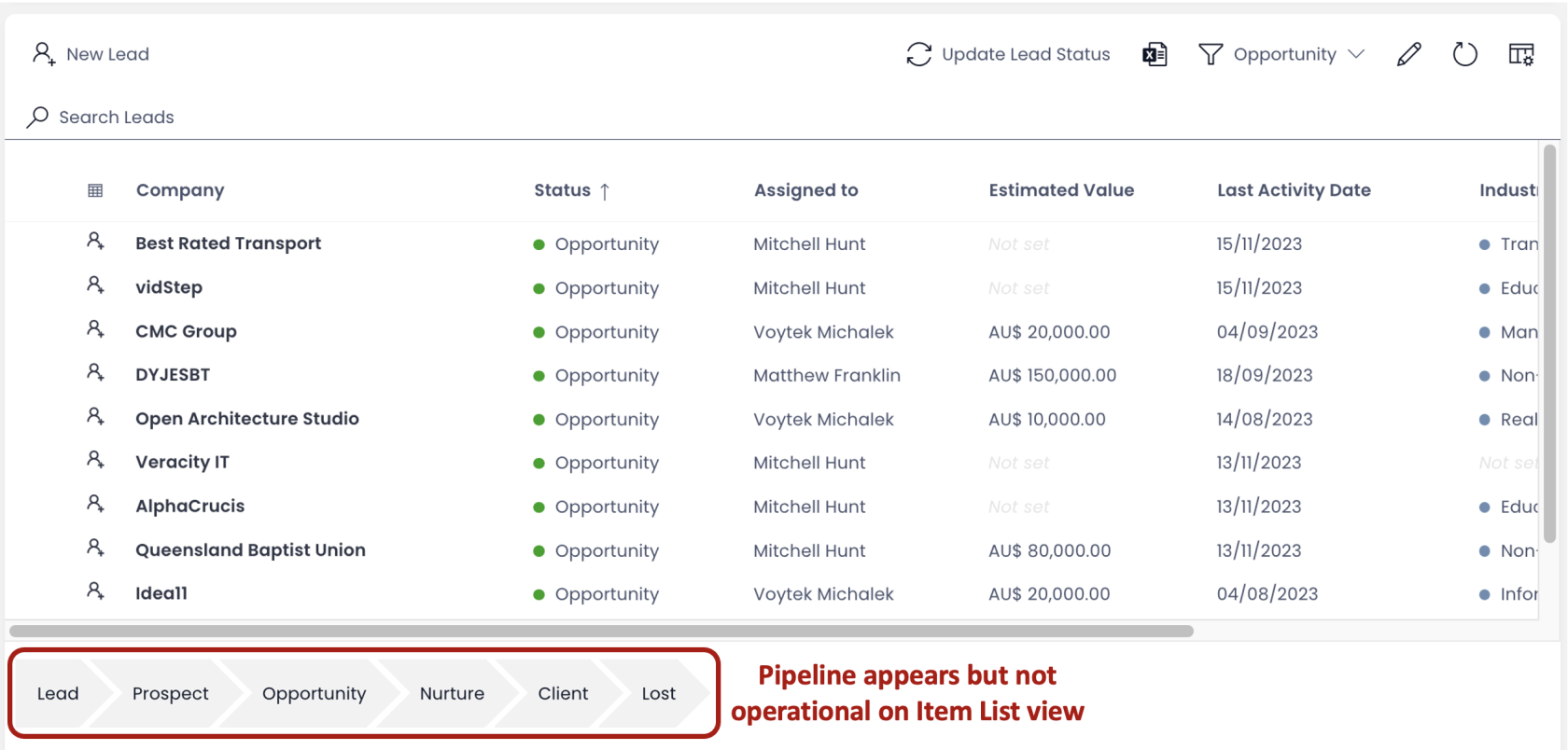
The Pipeline component is meaningful only on the Individual Item Level (singular). Although, you can add a Pipeline component to the Item Group List level (Plural), but it remains non-operational (and logically so).
-
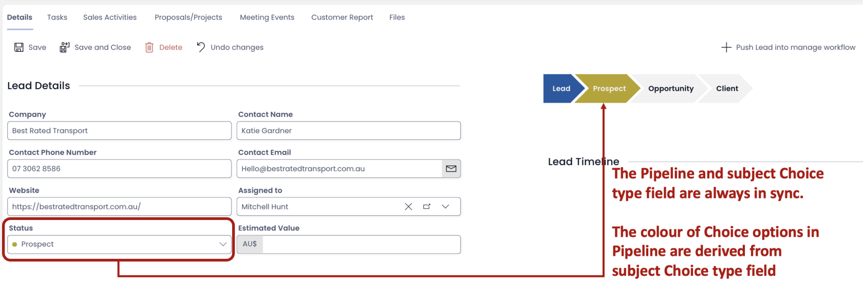
Selecting a value in the Pipeline is identical to selecting the option from a Choice Type field. If you have the same field added as a Choice Field on the Layout, you can view them to be always in sync with each other.
-
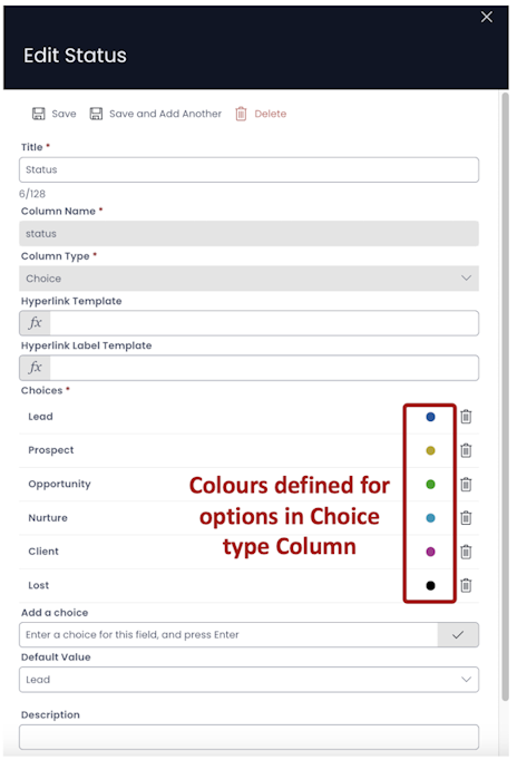
The colour of the Pipeline Choices are derived from the subject Choice Type field. While defining the options of the Choice Type column, if you have defined colours, the same will appear in the Pipeline.